Before and After: 3 Awful Façades Saved!
You only get one opportunity to make a great first impression so when it comes to your home, the impact your façade has cannot be underestimated. Though you might think that how your home looks on the inside is the most important factor, as that’s where you spend most time every day, you can’t ignore a shockingly drab exterior. It says more about you and your home than you might believe.
We’ve unearthed some truly shocking façade makeovers that will have you looking at your home and considering a fresh coat of paint. Be prepared as the before shots really are awful!
1. Before: Is that a coal bunker?
Oh, heck no! This is not what we picture when we think of appealing, attractive house façades. In fact, this is about as far from that as it’s possible to be.
The boring concrete, creeping rust and hideous door are all the stuff of nightmares. We don’t know whether this is a coal bunker, a prison cell or a slasher movie film set but, either way, we hate it. Call in the design team!
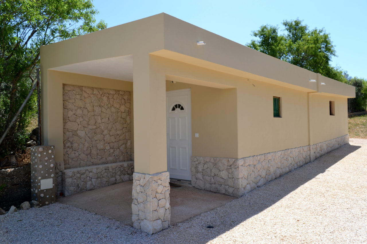
1. After: What a delightful annex!
Well, grandma certainly won’t mind coming to stay if you pop her in here! A mind-blowing transformation, this charming annex is totally revitalised and looks delightful with a cream screed and some lovely stonework. The completed work seems so simple but the impact is so dramatic.
We can now imagine setting this lovely space up as a spare room/self-contained annex, whereas before it literally resembled a punishment hole!
2. Before: Faded and flaking
What a sad way to treat a lovely and traditional home. A great size, this once white-rendered boxy build, with a gorgeous terracotta tiled roof, must have looked really something with the sun beating down on it. Unfortunately it now simply looks unloved and forgotten.
Empty flower beds, flaking paint and a lack of guttering all certainly take their toll on this home and we don’t think we’d be popping in for tea anytime soon!
2. After: Properly perked up
What a lovely difference a fresh coat of paint can make. You have to admit that this looks exponentially better and, with a happy flower bed brimming with new life, this home certainly seems a whole lot more friendly.
It’s great to see that the crazy paving pathway has been given a good scrub as the façade now looks far more considered and chic. It doesn’t take a lot, you know!
3.Before: Courting disaster
Why would you let a picture perfect home with a charming courtyard go to the dogs like this? It’s either laziness that caused this sorry state of disrepair or it was too much of a financial burden. Either way, what a shame.
With the perfect outdoor cooking area and a super sweet wall plaque already in place, there’s potential in abundance. Sadly it’s going to waste in favour of cracked, bare concrete.
3. After: Mellow yellow
Well, we say mellow yellow but there is nothing understated about this transformation! Just look at how warm, crisp and beautiful this space looks now. The dual tones of yellow work wonderfully together, helping to create lovely shapes and facets.
What a relief to see that the original wall plaque has remained as it has so much character and we think it directly influenced the colour choices. Such a fabulous first impression!


